


Trucks handle 73% of American freight. Behind every delivery is a fleet management ecosystem: fleet managers making strategic decisions, drivers executing routes, and administrators coordinating operations.Volvo Connect had low adoption rates across different fleet sizes.
Our research revealed three distinct user groups: medium-large fleets with specialized staff, small fleets with people wearing multiple hats, and Volvo dealership managers. Each had different needs and expertise levels, but all needed to interact with the same platform.
We prioritized small fleets (90% of the industry) who lacked specialized staff to interpret complex telematics. The design challenge: create a solution that serves small fleets' immediate needs while maintaining platform consistency for medium-large fleets and dealerships.
Our solution: Fleet Assist, an AI conversational tool that scales across contexts that would be accessible enough for small fleet managers wearing multiple hats, yet robust enough for specialized staff at larger operations.
To better understand the low rates of adoption and retention we conducted 8 exploratory interviews, 4 contextual inquiries, literature review, and competitive analysis. From these methods we came across several pain points.
From these methods we came across several pain points:
1) Small Fleets Lack Time to Turn Data Into Action
2) Small Fleets Need Access and Support
3) Small Fleets Juggle Multiple Tasks
Our prelimirary research really showed us how underserved small fleets were at the moment.
Before ideating solutions, we mapped the platform's user landscape and discovered a critical insight: Volvo Connect served distinct user segments with different needs and expertise levels.
1) Small fleet owners (90% of the market)–typically wearing multiple hats without specialized staff, struggling to have the bandwidth to interpret complex telematics data.
2) Mid-to-large fleet operators–companies with dedicated teams and technical expertise to leverage advanced analytics.
3)Volvo dealership managers–supporting their clients with varying technical capabilities across different fleet sizes
The systems-level challenge: We needed to design a solution that prioritized the underserved majority (small fleets) while maintaining platform consistency and value for the other segments.
Key insight: This wasn't just about designing one feature for one user type. Any solution we created would ripple across the entire platform ecosystem. What worked for small fleets needed to scale for larger operations, and dealerships needed to support clients across this spectrum.
Understanding all the players shaped our approach. We had to design for platform-wide impact, not just solve for one segment in isolation.
Our solution ideation started with a broad exploration of ideas, which we gradually narrowed based on what we saw would most effectively answer user pain points and the time constraints of the project. We started with drafting design recommendations. This led us to explore several concepts including a more refined way to present data, automating repetitive tasks, a conversational tool to help reach decisions faster, and improve sharing of data with one another. We narrowed down to 2 initial concepts: a dashboard redesign and a conversational AI tool.
Rapid Concept Testing
We spoke to industry professionals to get a quick gauge of which concept did they find more useful as well as ran both concepts with our sponsor panel at Volvo Group. This informed us to choose to build a conversational AI. Not only were experts finding value in it, this was most feasible for the tight time constraint we faced, strategically addressed the core objectives we sarted off with, and would have the most impact for transportation companies.
To address the problem of small fleets lacking time and staff to interpret and act on data, we introduced Fleet Assist, a conversational AI tool as an update to Volvo Connect.
Fleet Assist builds on Volvo Trucks’ existing telematics by translating complex data within Volvo Connect into clear, actionable guidance. Fleet managers can now ask Fleet Assist to retrieve the information they need, and perform tasks such as decoding faults and monitoring fleet performance all within the same Volvo Connect system they already use.
Now users have a have a decision-making partner, that helps them act faster and better perform.
Core Offering 1: Advanced Analytics
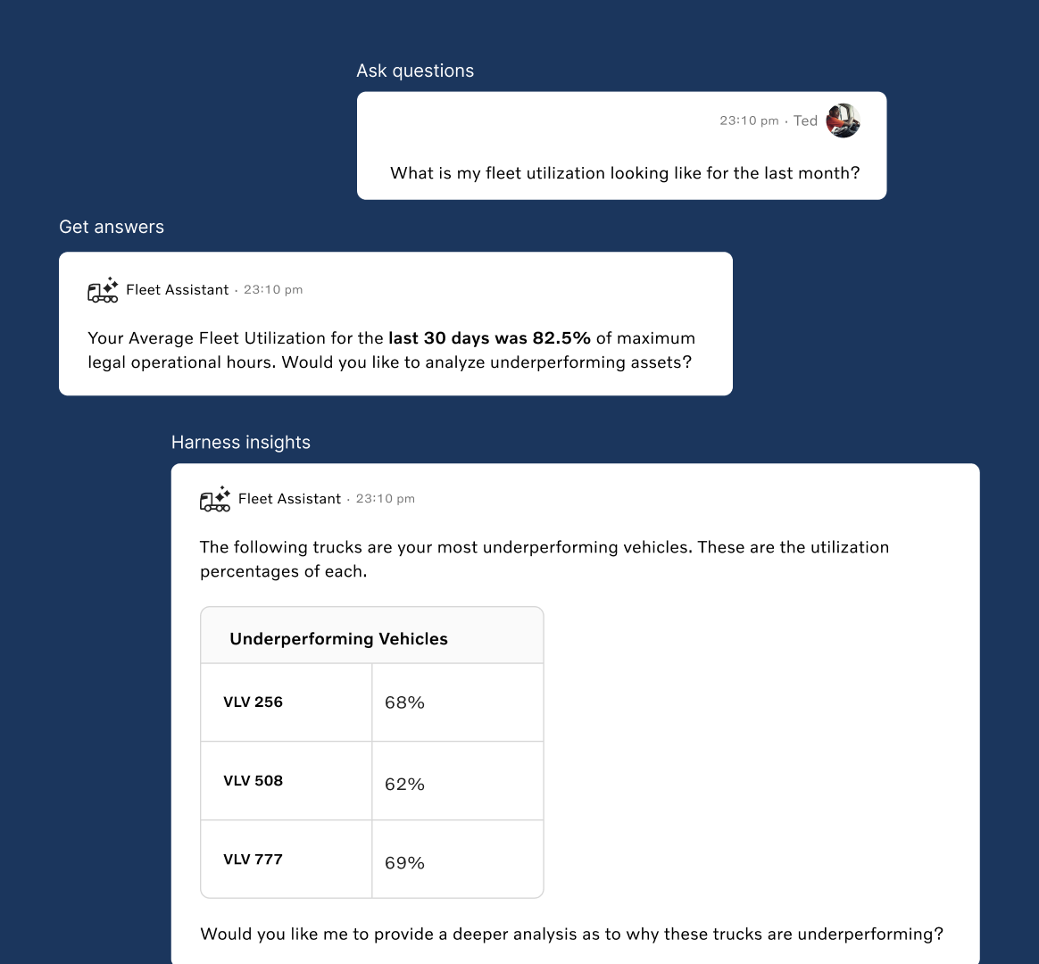
As a fleet manager, you’re constantly working to improve margins and optimize fleet performance. One effective way to do this is by analyzing fuel efficiency over time. So, let’s say a manager wants to view fuel efficiency for the last 20 days. Volvo Fleet Assist can instantly generate a table of key fuel-efficiency metrics, including fuel economy, daily fuel average, and mileage from the past 20 days. Fleet Assist gives our fleet manager an insightful analysis on factors that caused this inefficiency, like unscheduled maintenance or unplanned downtime. Our fleet manager can continue this conversation and dive deep into those unplanned events such that they can optimize their fleet and improve important KPIs.
Core Offering 2: Direct Data Inquiry
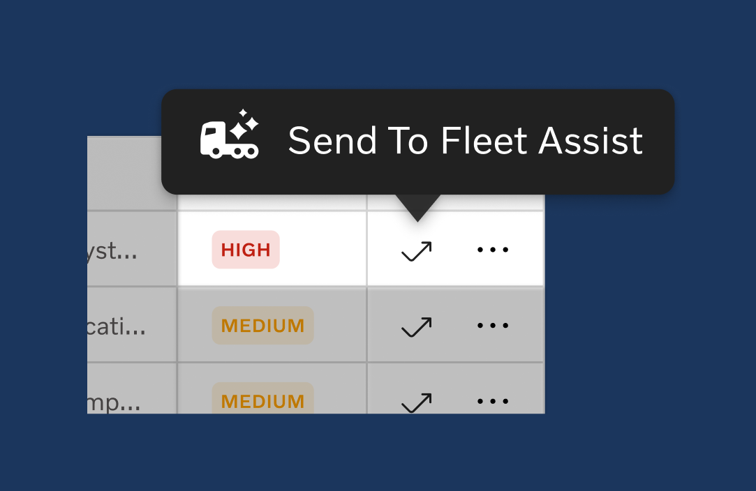
Another reoccurring problem we came across was fleet managers needing to consult manuals and dealerships to understand complex data points like fault codes. With the send to Fleet Assist button, users can directly inquire about specific pieces of data points and they can get immediate answers instead of having to parse through large manuals or spend time finding help at dealerships.
We used rapid prototyping for our usability tests to make the most out of feedback from each session. Each week as we were running usability tests we would improve our prototype in time for the next user test. We conducted a total of 8 usability tests and collaborated with our Volvo sponsor panel on Figjam to analyze the to analyze the emerging themes that led to our final design.
From usability testing we understood that our tool should offer:
1) Guidance on how to navigate situations & respond
2) Offer a streamlined way to access information
3) Accessibility for data, regardless of expertise & level
These takeaways informed us to craft our 2 core offerings that ended up with in Fleet Assist.
We achieved a 90% satisfaction rate in usability testing, validating that Fleet Assist successfully simplified complex data while maintaining platform consistency across different fleet contexts.What this project taught me:
1) Multiple stakeholders, one platform: Fleet managers, drivers,
and administrators all interacted with the same data differently.
2) Designing for scale: The solution needed to work for small
fleets wearing multiple hats AND specialized staff at larger operations.
3) Ripple effects: Design decisions for one user group affected
the entire ecosystem.
This experience sparked my passion for platform design and service thinking, understanding the entire system and how all the pieces connect, not just optimizing individual features.