


{ What if the places you've been could hold the stories of everyone who came before you? Memory Lane is a geocaching-inspired mobile app that lets people leave memories tied to physical locations for strangers to discover. Built to encourage outdoor exploration and meaningful connection, it reimagines the social feed as something you have to physically travel to find. }


During the pandemic, people rediscovered something they had quietly been losing: the value of being outside and present with each other. At the same time, the platforms designed to help people connect were doing the opposite, optimizing for scroll time over lived experience.
Our team shared a genuine investment in this tension. All three of us spent time outside to decompress, explore, and feel grounded. We wanted to design something that built on that impulse rather than competed with it.
Our first instinct was to design for a problem we had experienced firsthand. When hiking in a group, especially one with mixed skill levels, staying connected is harder than it sounds. People move at different paces, signals drop, and the group splinters.
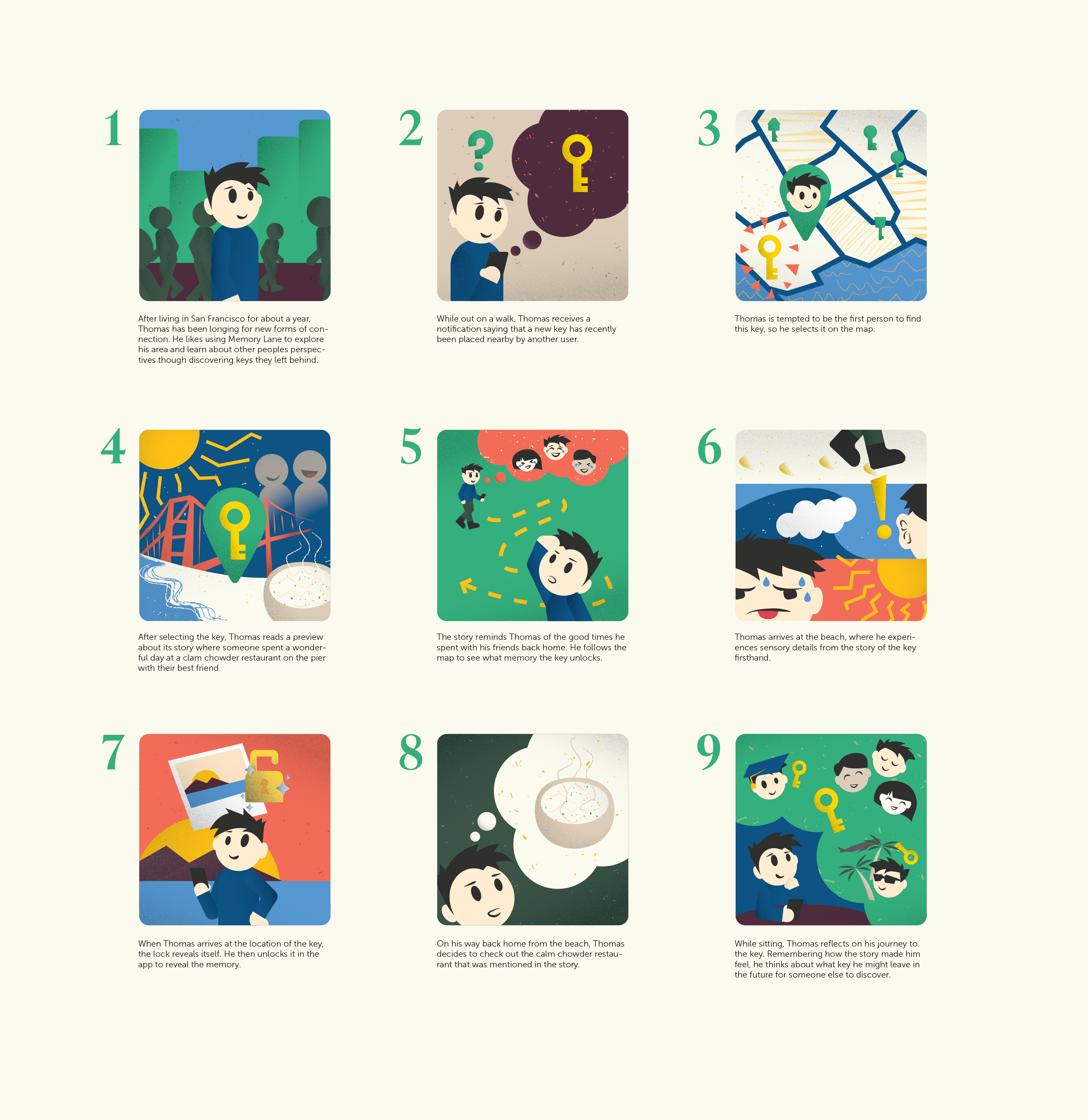
We mapped out a scenario: a group of friends at varying skill levels sets out on a trail together. During the hike they get separated. One pair wants to push ahead while the other stops to take photos. One pair needs water from the other. Without a way to communicate, a simple coordination problem becomes a real friction point. They eventually find each other, finish the hike, and debrief over food. But the experience of being disconnected mid-trail stuck with us as something worth solving.
We started designing a communication app that would help groups stay coordinated on the trail in real time.
{ Real-time communication requires connectivity, and trails don't have it. The technology couldn't support the concept. We had to start over. }
Rather than forcing the original concept to work, we took a step back and asked a more open question: why do people go outside in the first place?
We interviewed 10 people (n=10) about their relationship with outdoor activity. The responses pointed in a consistent direction. People go outside to:

Step away and reset.

Have experiences worth keeping.

Spend time with people who matter.

Discover new places.

Relief from daily stress.
{ In short, people go outside to feel connected. And the pandemic had made that need louder. }
We had the insight. What we didn't have was a design direction.
While brainstorming with a friend, her mother overheard the conversation and asked if I had ever heard of geocaching. I hadn't. She explained it: a scavenger hunt where people follow clues to a hidden object, sign a log, and sometimes swap something in. The concept clicked immediately. Geocaching made exploration feel purposeful and rewarding. But objects alone weren't what we were after.
What if instead of hiding objects, people hid memories?
We brought the idea to the team and quickly ran a light assumption check, asking three people how they make, store, and share experiences. What came back confirmed the direction. Social media had become performative. People stored their most meaningful memories privately. And when it came to other people's lives, they cared most about the people they were already close to.
{ People didn't want more content. They wanted more meaning. }
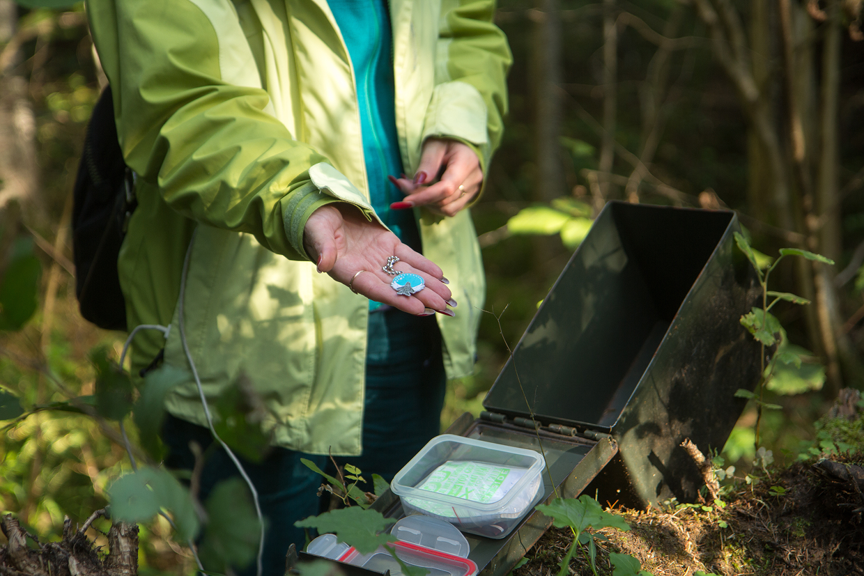
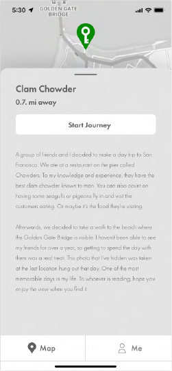
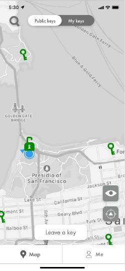
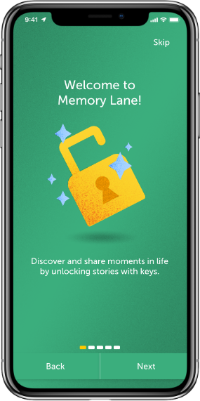
Memory Lane is built around a simple metaphor: locks and keys. Someone has a meaningful experience at a location and leaves it as a key on the map. Someone else discovers it, physically travels there, and unlocks the memory upon arrival. Inspired by what they find, they leave a key of their own.
{ The cycle turns strangers into storytellers. }
Meet Thomas. His journey illustrates how Memory Lane works end to end.
Site Architecture
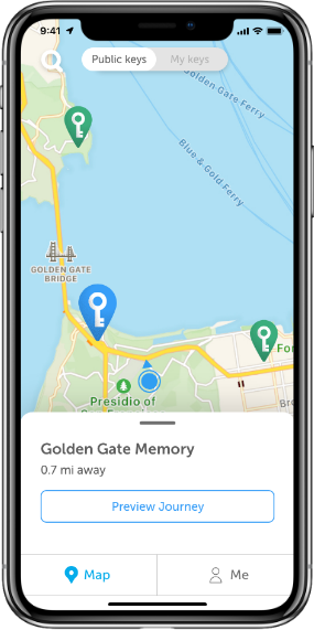
We structured navigation around three branches: onboarding, map, and me. The map is the first thing users see after signing in because journeys are the core action we wanted to prioritize. The me section houses a ranking system tied to keys found, which gives users a reason to keep exploring beyond their first unlock.

We decided to name our app Memory Lane because we were creating a concept that users were metaphorically and literally going though someone else's memory. The phrase "a walk down memory lane" felt very accurate to out product, hence the name.
The logo combines a location pin with a key inside it, communicating the app's core mechanic at a glance. You are always navigating toward something worth unlocking. The wordmark uses a serif typeface to feel warm and quietly nostalgic rather than clinical or tech-forward.


Ivy Presto was chosen for its warmth and nostalgic quality, fitting for an app centered on memories. Museo Sans pairs with it for body text and UI elements, keeping the interface readable and approachable without competing with the personality of the headline face.
Illustrations are flat with subtle grain and gradient, giving them depth without overcomplicating the visual language. The friendly, rounded characters lower the emotional barrier to sharing personal memories. The style feels handcrafted and human rather than polished and corporate.

We structured navigation around two branches: map and me. The map is the first thing users see after signing in because journeys are the core action we wanted to prioritize. The me section houses a ranking system tied to keys found, which gives users a reason to keep exploring beyond their first unlock.
We tested our low-fidelity prototype with nine users (n=9). The concept resonated but testing revealed consistent friction points across three themes: clarity of navigation, satisfaction at key moments, and motivation to keep engaging.


On navigation, users were confused by the placement of the Start Journey button on the preview screen, causing most to skip the story entirely. The Me section wasn't clearly identified as where found and logged keys lived. And a map settings page that fell outside the core narrative created unnecessary confusion.
On satisfaction, most users felt the flow ended abruptly after finding a key. The unlock moment didn't feel sufficiently resolved, and users expected to see a message or some form of acknowledgment when completing the process. The end of the journey needed more ceremony.
On motivation, users questioned what the incentive was to go outside and find keys. This surfaced opportunities we hadn't designed for yet: push notifications for nearby keys, reminders for users who hadn't found a key in a while, and a ranking system tied to key customization so progression felt meaningful rather than cosmetic.
Here is the final design of Memory Lane, incorporating changes from user testing.
We structured navigation around three branches: onboarding, map, and me. The map is the first thing users see after signing in because journeys are the core action we wanted to prioritize. The me section houses a ranking system tied to keys found, which gives users a reason to keep exploring beyond their first unlock.
Added onboarding to make purpose and interactions of the app clear.
Added a preview button to eliminate the confusion of when the journey actually starts.

Giving more details like who posted and how many people have already been on. Yet, scaling back on the word count so the preview isn't too overwhelming.

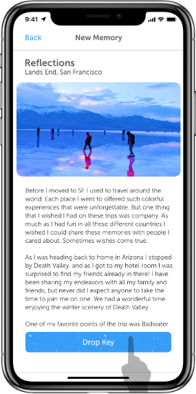
Adding text so that it's clear that memory has been unlocked. And making this moment feel more celebratory.

Memories unlocked no longer were just images, they had written stories too.

Added the ability to comment to add more sense of community on the platform.

Made the end of a journey feel more of a celebration and an achievement.

Also now showcased how leaving a key works.

Wanted to add filters to give more expression for users to play with as they share their stories.
This is what the editing space looks like before dropping a key.

To give more incentive to discover memories we incorporated a ranking system based on the amount of keys found.

You can also see the history of your explorations in case you wanted to revisit any journeys. Seeing volume always inspires for more action.
Memory Lane is honestly one of my favorite projects I have worked on. The pivot is what makes it special. We started with a real problem, hit a genuine wall, and instead of forcing a solution, let the research lead us somewhere we never would have gone otherwise. That kind of constraint turned out to be the best thing that could have happened to the project.
Presenting to the Nvidia UX team was a highlight. Their feedback about map safety and content moderation was exactly the kind of real-world thinking we needed. It reminded us that designing for connection also means designing for trust, and that would be the first thing we would tackle if Memory Lane moved forward.If this product shipped, we would want to measure how many users return for a second and third unlock, whether the ranking system genuinely motivates exploration or starts to feel like a chore, and how the community evolves when strangers start finding each other's memories in the wild.
This project reminded me why I got into design in the first place. The best solutions are not always the ones you planned for.

