


{ MagIC Lifescience is a medical diagnostics startup working to make molecular testing faster, more affordable, and more accessible. For 2 years, I was their go-to designer for marketing materials, developing a cohesive visual system that communicates complex science clearly to conference attendees, partners, and investors. The company has secured funding from multiple institutions including the Gates Foundation. }

{ MagIC Lifescience was a new medical devices company preparing for conferences and investor meetings. They approached me to extend their brand beyond the logo and develop marketing materials that could represent the quality of their product in high-stakes settings. }
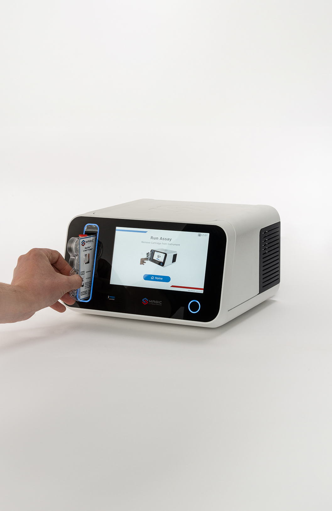
Their original brochure had been designed by the same vendor who built the exterior of their diagnostic machine, functional but not optimized for marketing. As the company prepared for conferences and investor meetings, they needed materials that better reflected the quality and innovation of their product. I redesigned the brochure to fit front and back on a single letter-sized sheet, the first test of what a stronger visual identity could look like for the brand.


The information was dense and technical, and the original layout gave it no room to breathe. I worked through multiple iterations to find a structure that organized the content clearly without losing the precision and credibility the brand needed to convey.


After several iterations, I landed on a final design. The front page gives visual and written context for how the device works in a clinical setting, covering the high-level functionality and product benefits. The back goes deeper into the sensor technology and technical specifications.


I extrapolated shapes and colors from the logo to build the visual motifs used throughout the brochure. Once that approach proved successful, I applied the same system to every other material they needed: banners, business cards, and presentation slides.
Note: slides are not shown due to sensitive client information.

With the visual system established, I extended it across the remaining deliverables. The banners and business cards were designed to show up consistently alongside the brochure at conferences and investor events, ensuring MagIC Lifescience presented a cohesive identity across every touchpoint.


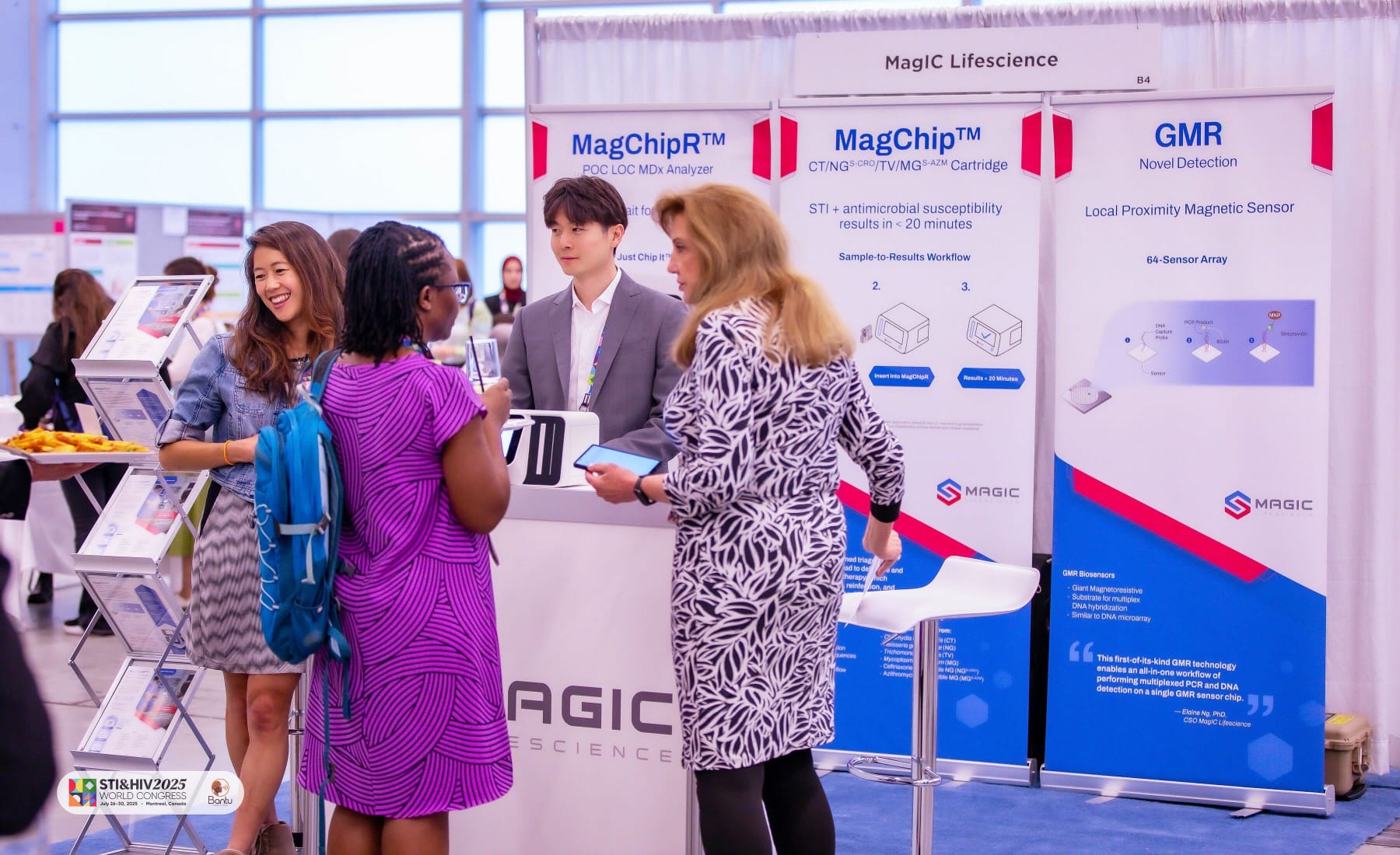
Banners on show in Montreal.


Working with MagIC Lifescience taught me that good design in a technical field is fundamentally an act of translation. The science was genuinely groundbreaking, but without materials that could organize and present it clearly to investors and conference attendees, it risked going unnoticed. Working from the existing logo as my only starting point, I built a visual system from the ground up that gave dense technical information structure, hierarchy, and credibility. Seeing those materials in use at conferences and knowing they contributed to the company securing funding, including from the Gates Foundation, made this one of the most meaningful projects of my career.

