


{ Loop.tv is a B2B streaming service that helps businesses display short-form content and run advertisements on their screens. After a company rebrand, I joined as a Visual Designer to build the design system that would make the new brand identity functional across every touchpoint, from social media to enterprise presentations to channel logos, under the creative direction of Niko Thiel and Luke White.}

{ Loop had just completed a rebrand. There was a new logo and a signature gradient. What didn't exist yet were the rules, templates, and visual devices that would let different teams actually use the new identity consistently. My job was to build that system from the ground up. }
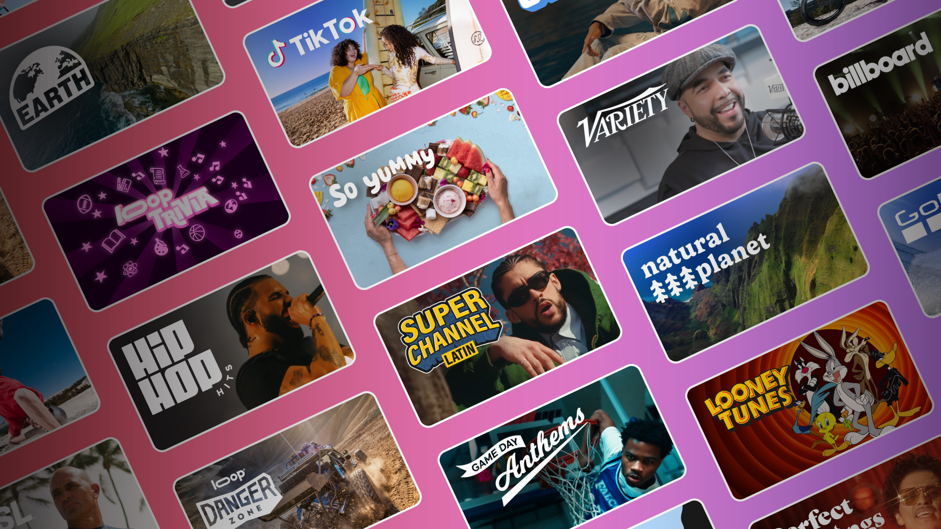
With only a logo and a gradient as my starting point, I extracted shapes from the logo mark and used the primary colors to develop a set of visual accents that could be applied flexibly across any format. Rather than building an illustration library that would compete with Loop's diverse content lineup, spanning sports, music, food, and entertainment, I kept the system modular and accent-based. The gradient and logo-derived shapes did the heavy lifting without overwhelming whatever content sat alongside them.


I applied the visual system first to social media posts, testing how the accents held up across different content types and announcements. Once the approach proved consistent, I built a reusable template for the marketing team so they could produce new posts independently without needing a designer for every piece.


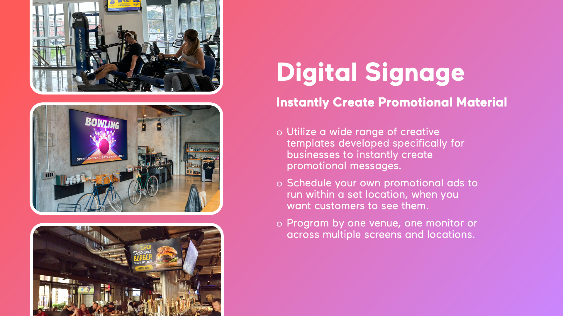
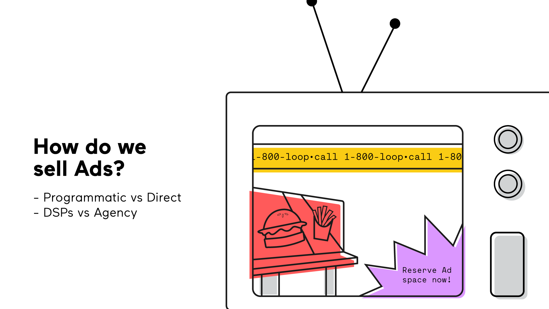
Loop's business customers needed a way to build and display their own advertisements within the platform. I designed a set of ad templates that gave customers a polished, structured starting point regardless of their design experience. The goal was to make every ad feel on-brand for the businesses using it while staying flexible enough to work across industries.


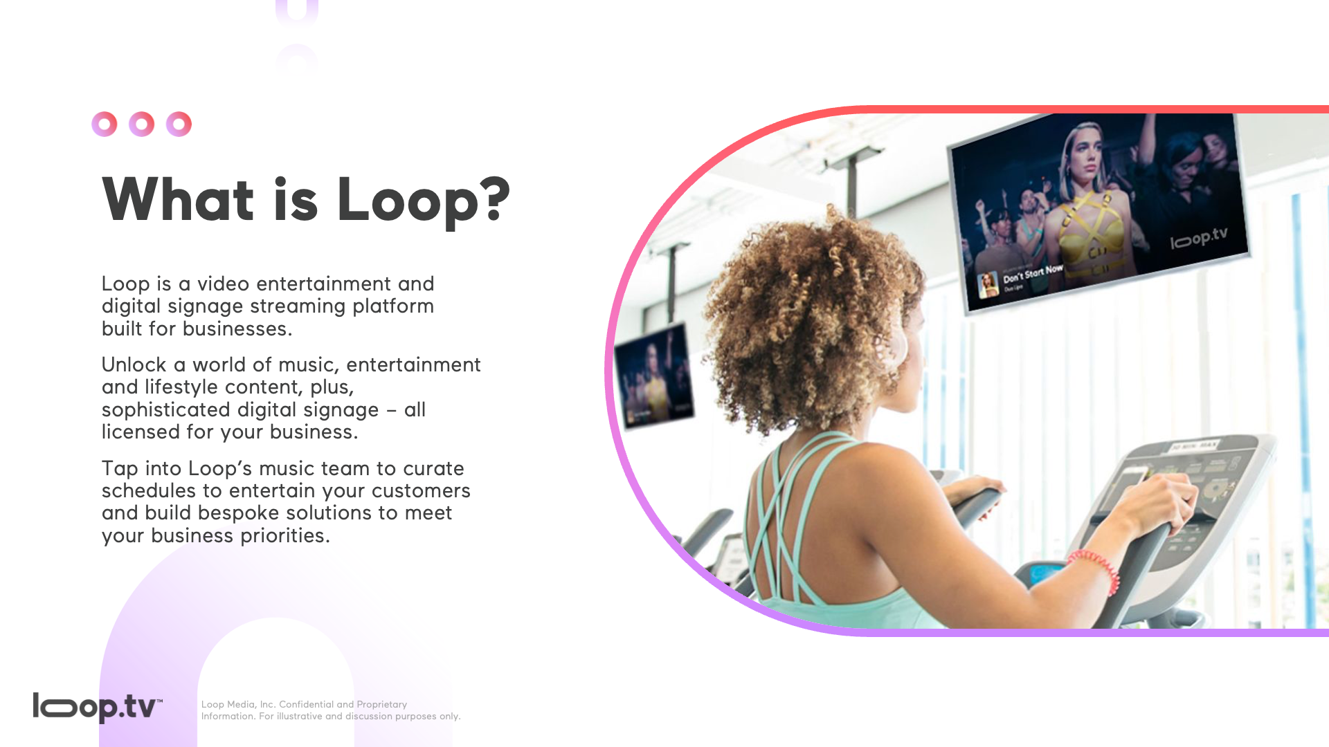
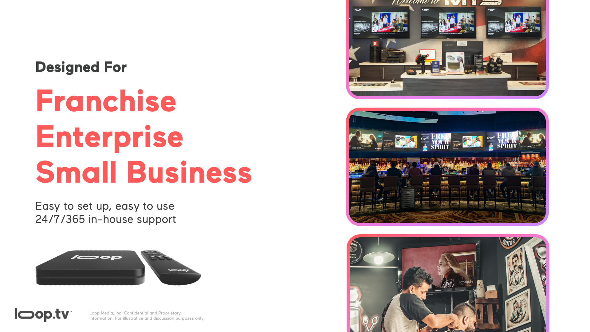
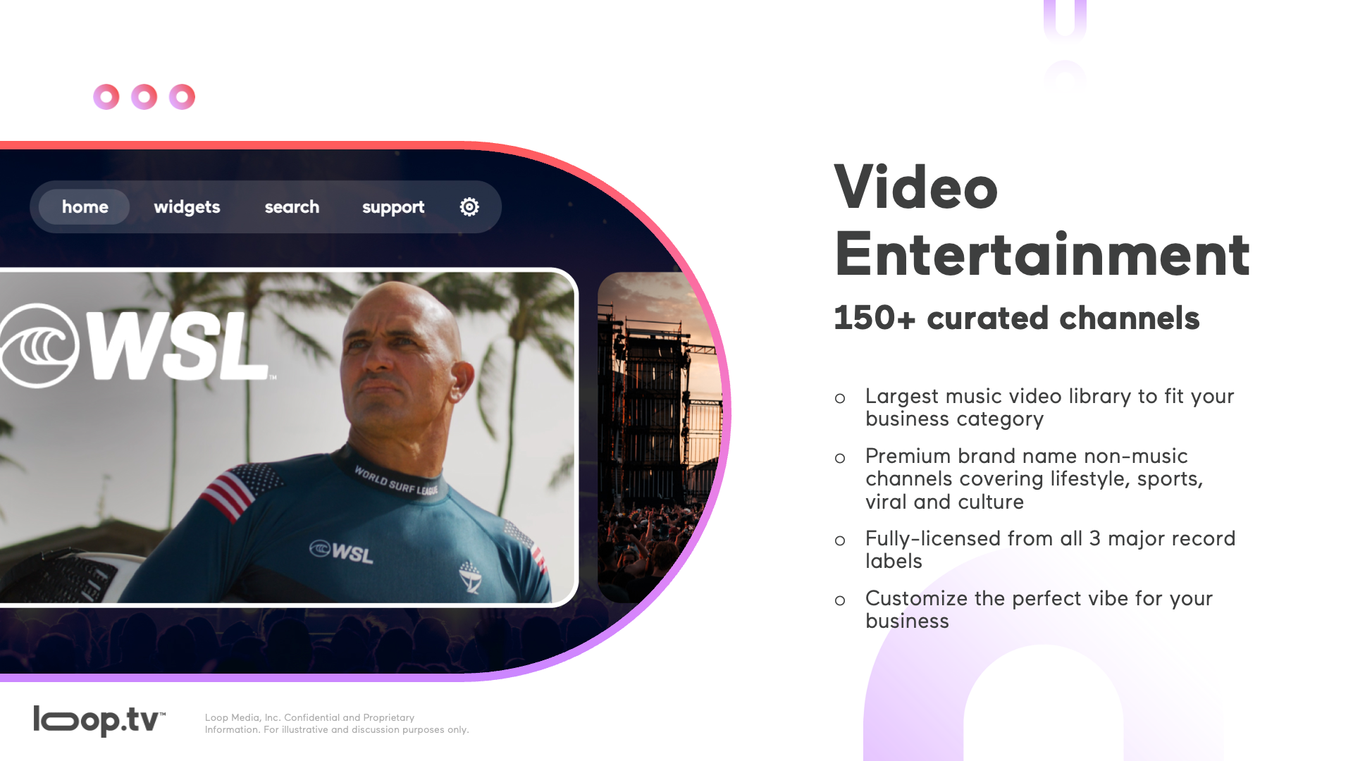
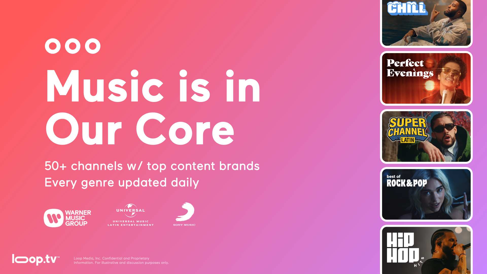
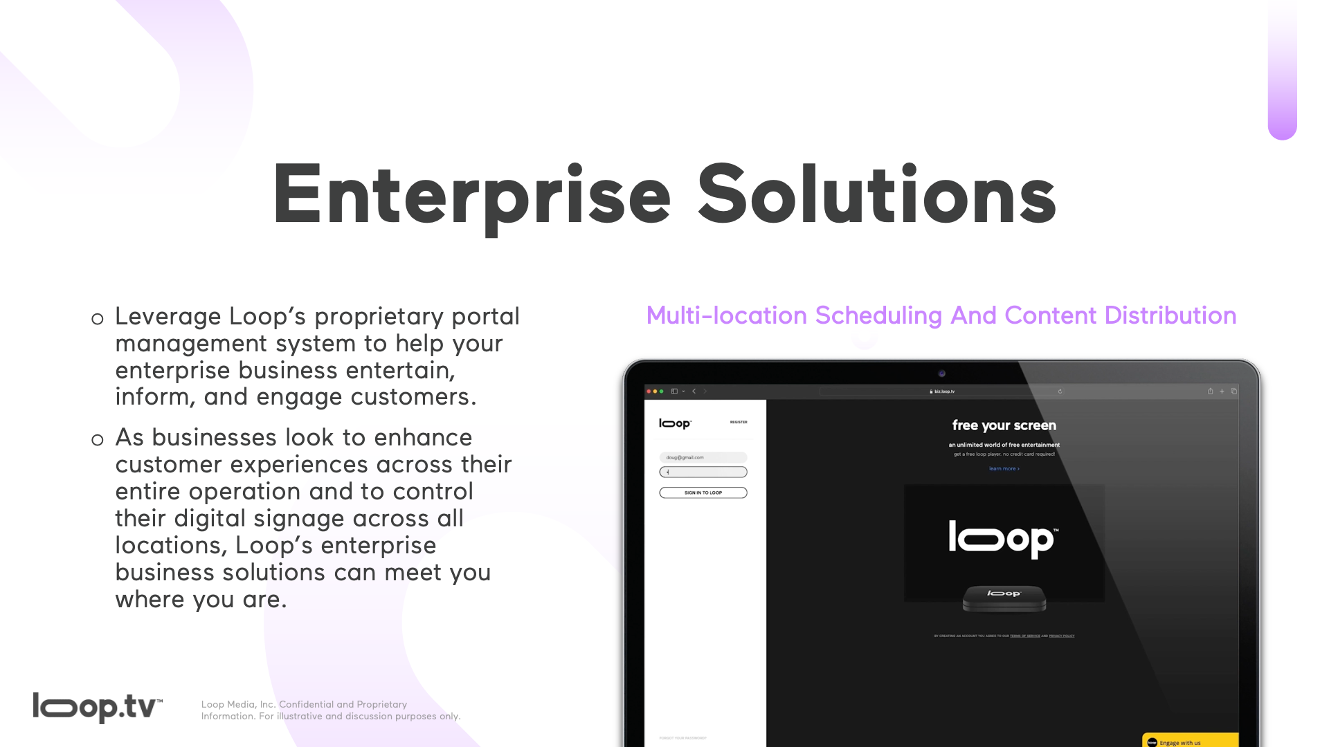
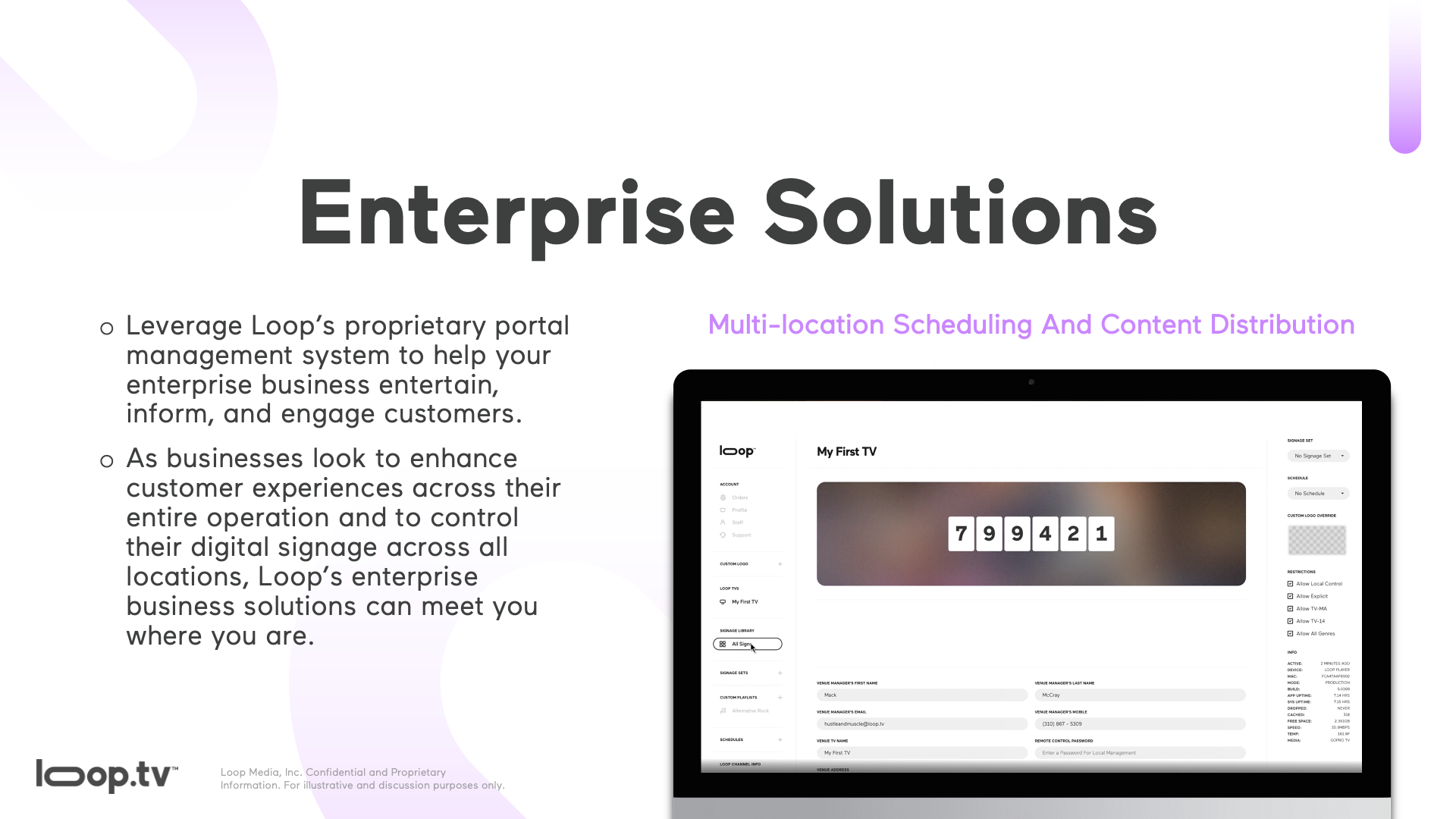
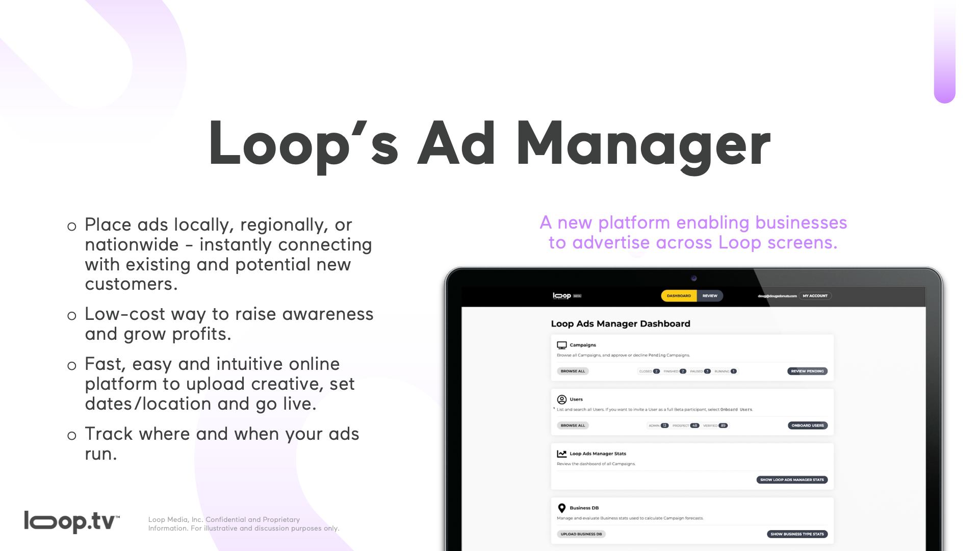
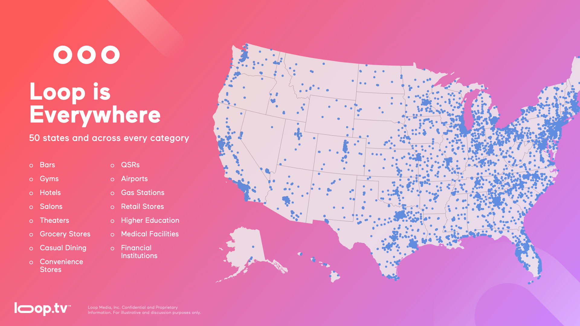
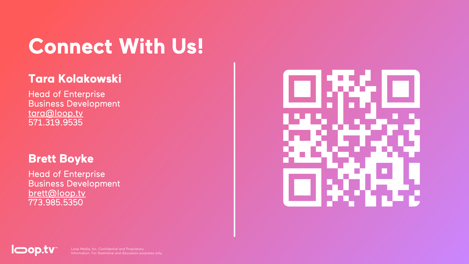
The enterprise team used a presentation deck to pitch Loop to potential clients and partners. The existing deck needed a full redesign. I worked directly with the enterprise team to understand what information they wanted to keep, what could be cut, and how to organize the remaining content for clarity and impact. The result was a visually cohesive deck that communicated Loop's value proposition clearly to a business audience.
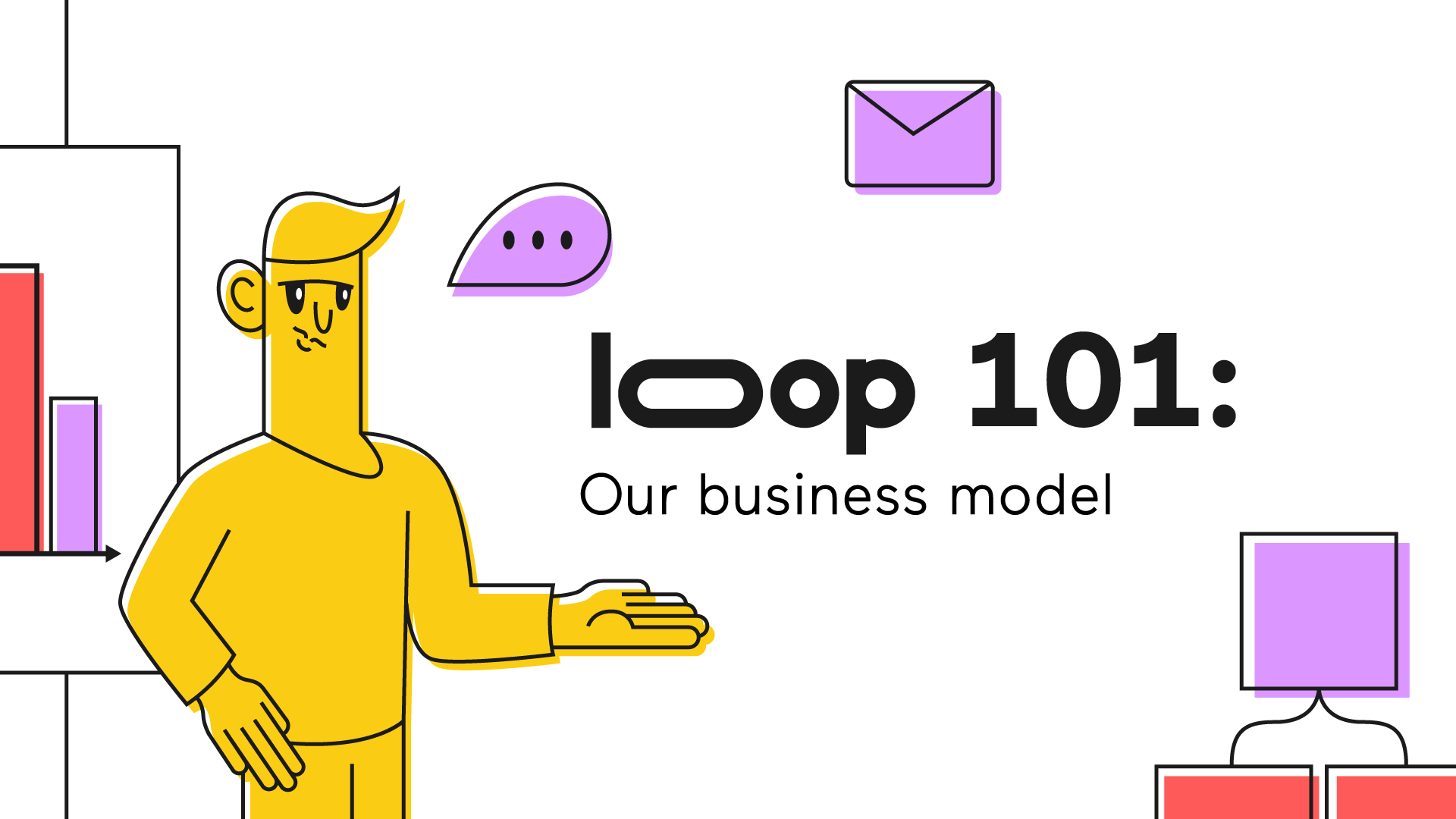
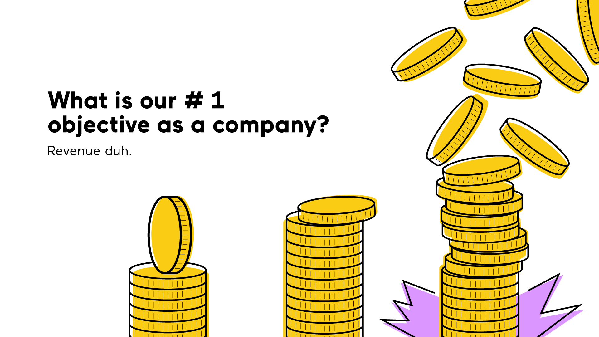
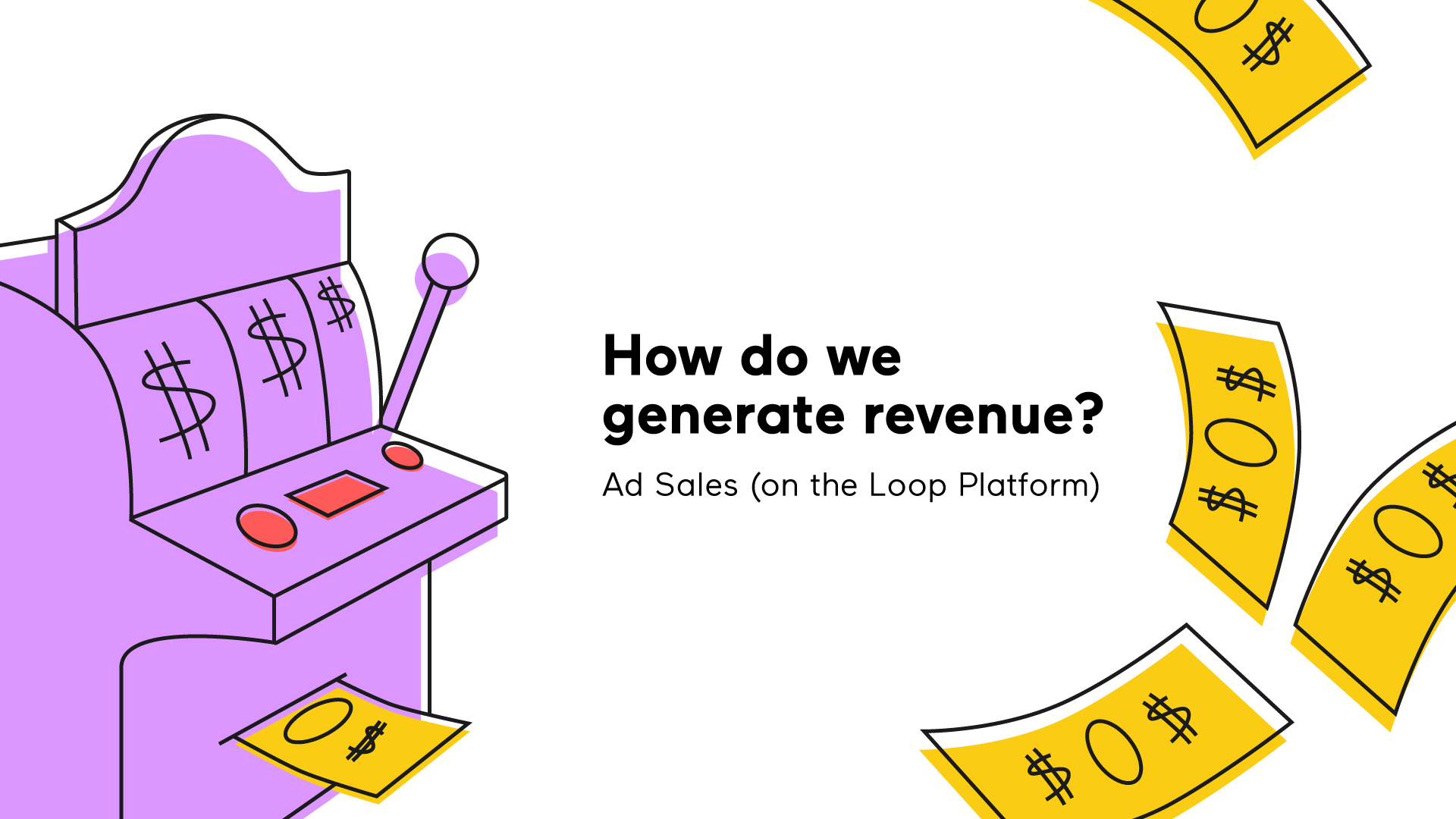
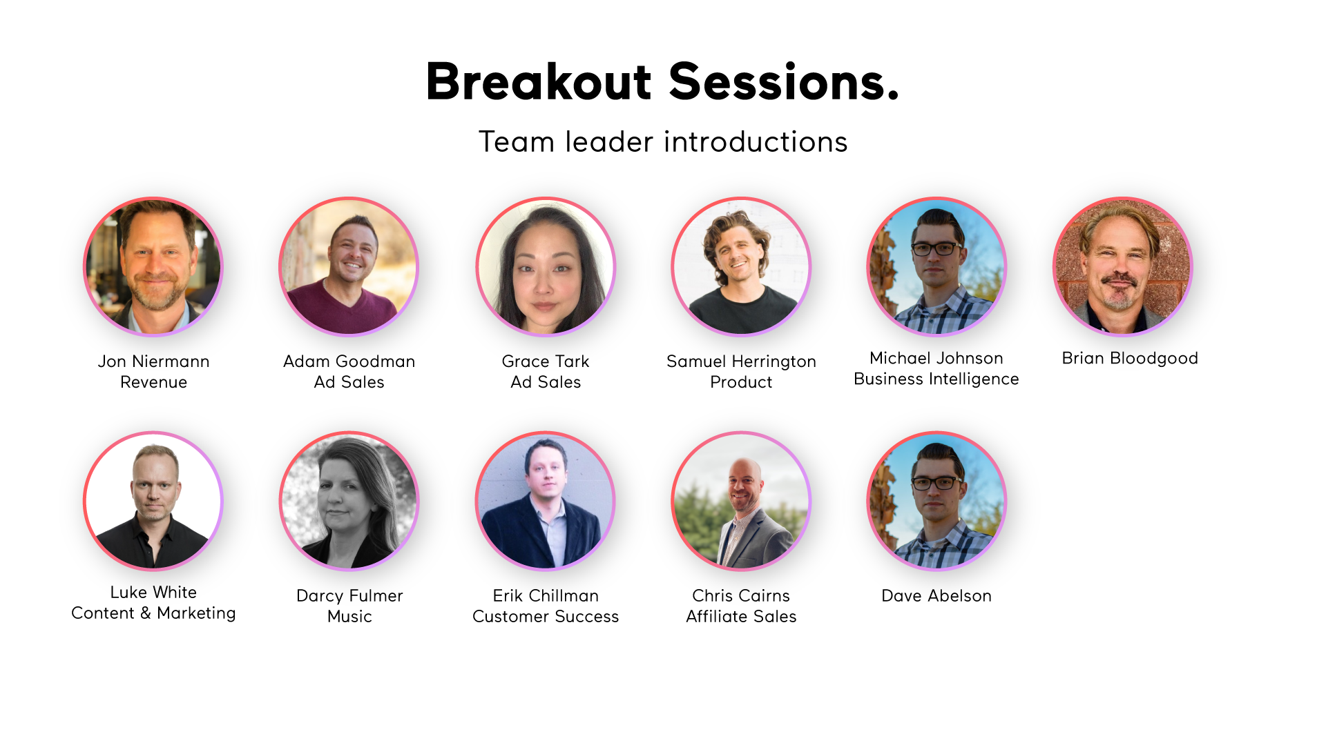
I also designed a presentation for Loop's company wide all hands meeting. This required translating internal information into a clear, engaging format for an audience spanning every department and role in the organization. Designing for a broad internal audience meant prioritizing readability, hierarchy, and visual consistency above all else.
When Loop renamed one of their channels to Loop Trailers, I designed the new channel logo. The mark needed to feel like a natural extension of the Loop brand while communicating the cinematic, trailer-specific identity of the channel. After the logo was finalized I handed it off to in-house motion designer Chris Marano for animation.
This role taught me that a design system is only as useful as its flexibility. Loop's content spans dozens of industries and visual styles, so the system I built had to feel cohesive without being rigid. Starting from just a logo and a gradient, I developed something the team and their customers could use independently. The presentation work especially pushed me to think about how design shapes communication, not just how things look, but how clearly information lands with the people who need to act on it.

