


{ Taking medication sounds simple until life gets busy. Honey Dose is a medication tracking app designed to make managing prescriptions, vitamins, and refills as frictionless as possible. Built around a bee and hive metaphor, it brings a sense of warmth and personality to a category that usually feels clinical and 1 forgettable. }


{ Forgetting medication is not a willpower problem. It is a design problem. Life moves fast and even when you mean to take your pills, something gets in the way. Most apps I looked at treated this like a data management issue. I wanted to treat it like a human one. The goal was simple: design something that actually fits into how people live rather than adding one more thing to manage. }
I surveyed 14 people (n=14) about how they actually dealt with vitamins and medication day to day.

Took vitamins or medication regularly.
Took them daily.
Admitted they sometimes forgot.
Used any kind of tracking tool.
Confidence in vitamin knowledge.
Confidence finding info online.
The part of this project I enjoyed most was finding the concept.
Bees are efficient and organized. They build everything around the hexagon, one of the strongest shapes in nature.
And if you simplify a bee's body down to its most basic form, it looks remarkably like a pill capsule. Hexagons also show up in chemistry diagrams to represent molecular bonds. The connection felt too good to ignore.

Chemistry
+

Pills
+

Bees
+

Hives

I sketched several directions before landing on the bee-as-pill character. Early attempts were too literal. I kept pushing until I arrived at a capsule-shaped body with bee wings and a hexagonal backing. Friendly without being childish, and communicates the product's purpose without spelling it out.

Laca is the chosen typeface. Clean enough to be readable at small sizes but with enough personality to feel distinct from a generic health app. The hexagon shape carries from the logo all the way into the UI, data display, and the notification interaction.
Three main flows: the dashboard, adding medication, and a nutrition info section. The dashboard comes first because your existing medications are the most urgent priority.

The original version of this project was called VitaTrack. It established the concept but testing revealed it was trying to do too much at once.
The weekly intake graphs were overcomplicated and nobody in testing found them useful. The vitamin checkoff required too many taps. The nutrition info tab kept getting flagged as unnecessary since people preferred to search for that information themselves. Visually it had a clear identity but lacked the personality I wanted.
Testing made the cuts clear. The harder part was accepting that the version I had worked hard on needed a full rebuild. So that is what I did.

Originally I wanted to offer users a way not only track daily intake but also weekly if they were keeping up with their medication.

This made the dashboard way too long. And during usability testing no one really cared for the graphs.

This was a good first draft for adding a reminder however it was lacking a system for reminding people for refills.
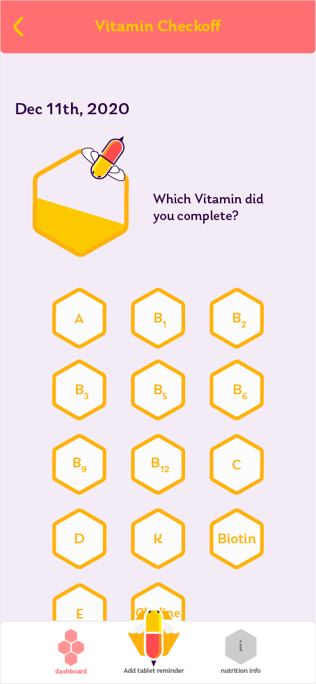
Users found seeking a tapping medication for checkoff cumbersome in this format.

Feedback relayed, that the info tab was unnecessary and that people rather use Google to learn about nutrition.
The redesign focused on two core jobs: making it easy to add medication and making it even easier to respond when a reminder fires.
Site Architecture
Adding medication now happens across two focused steps rather than one overwhelming page. The first establishes the refill setup, searching for your medication, setting dosage, intake type, and a low pill count alert. The second sets the schedule, frequency, alarm times, and which days it applies. Once added, the medication appears immediately on the dashboard alongside your checklist, upcoming alarms, and any active refill alerts.

Splash screen.

Removed the weekly graphs. If needed, people can still refer to past data by the days at the top.
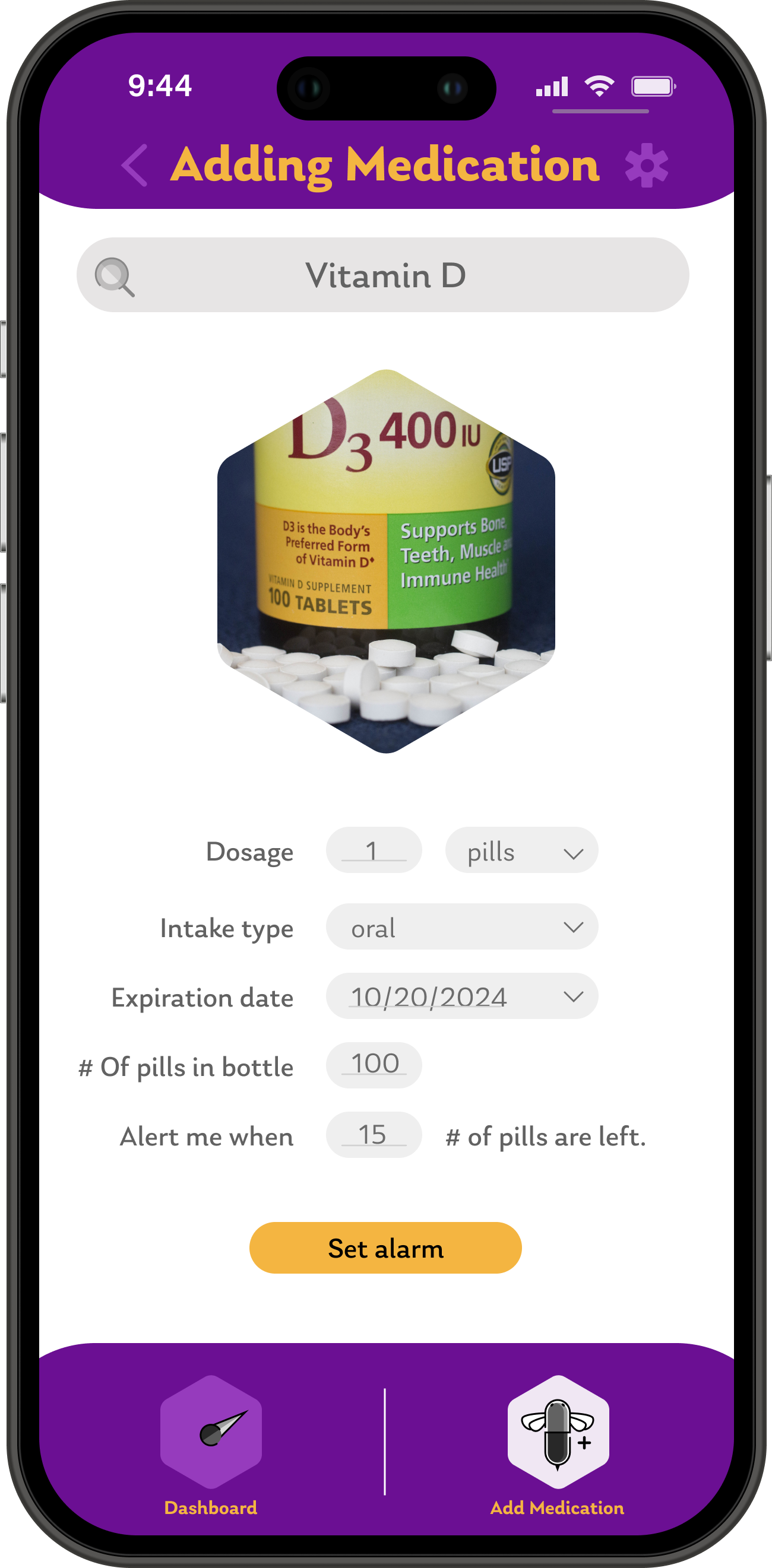
Adding medication now has two steps. The first is for establishing a refill alarm.

The second page is to establish intake alarms.

Once added changes are reflected in the dashboard.
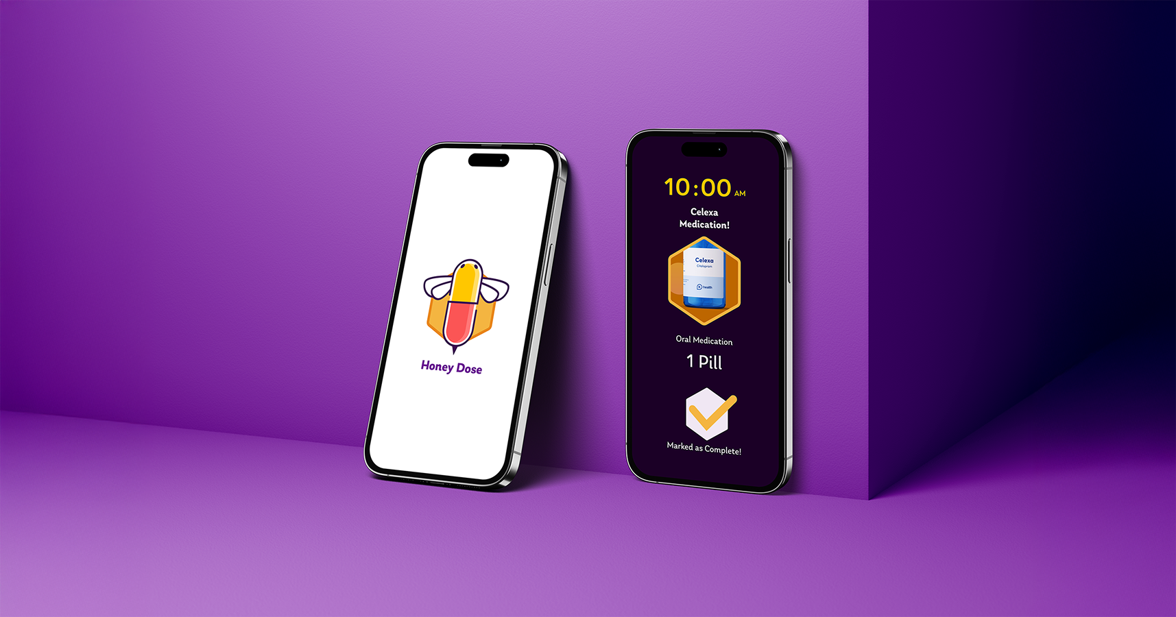
Responding to a Notification
When an alarm fires, you see the time, the medication name, and a clear visual of the pill. Rather than opening the app and navigating to a checklist, you drag the hexagon to one of four responses: Mark as Complete, Remind Me Later, Go to App, or Ignore. One gesture, done. The dashboard updates automatically and a clear completion state confirms the action.

Instead of having a cumbersome list, medications can be marked complete when the alarm rings.

You can chose an option by dragging the hexagon.

Clear indication of completion.

Changes are reflected on the dashboard.
Honey Dose is one of my favorite projects because the concept actually held together end to end. The bee metaphor started as a visual idea but ended up informing structural decisions too. The hexagons in the checklist, the notification interaction, the pill-shaped character, none of it felt forced because it all came from the same place.
The redesign reinforced something I think about a lot: restraint is a real design skill. The original VitaTrack had more features. The redesign had fewer, and it was sharper for it.
If I kept going I would break the medication setup into even smaller steps, prototype the notification for smartwatch, and invest more in onboarding so users understand the hexagon gesture before they encounter it in the wild.
On accessibility: the high contrast between the deep purple background and gold typography in the notification flow was intentional. Medication reminders arrive in real life contexts, often when you are distracted. Legibility at a glance was not optional.

